If I were to talk of the greatest films in the last decade that changed the very idea of what cinematography could accomplish, Christopher Nolan’s Inception (2010) would undoubtedly count among them. It marked a perfect union between original storytelling and practical cinematography that was previously unheard of. The story of a dream extractor Cobb (played by Leonardo Di Caprio) who treads the line between reality and dreams was told in a visual medium that captured all the distortions and impossibilities such a story required.
Nolan worked with cinematographer Wally Pfister on the film. Their shared emphasis on an original treatment for an original story, steeped in naturalistic camera techniques are the film’s totem, so to speak. For his work in Inception, Pfister received much praise and accolades, including the Award for Best Cinematography at the 83rd Academy Awards.
Let’s take a look at some of the elements and techniques that Pfister uses in Inception.
RELATED READ: Inception Explained: What Nolan Really Wanted You to Know
Balancing surrealist storytelling with realist techniques
Reality and dreams constantly shift in Inception. It is a film with multiple layers of fact and fiction that unfold simultaneously. However, it was not Nolan’s intention to flood the film with any composition that suggested an excess of surrealism. Rather, his approach was towards photographic realism. Nolan, of course, is known for shooting on film, he is one of the few well-known directors in Hollywood to still do so. Inception was shot on film as well, mixing 35 mm anamorphic with 65 mm anamorphic cinematography for significant scenes, as Pfister and Nolan had previously done on The Dark Knight (2008).
WATCH: Inception Explained: Plot, Ending (Complete Breakdown)
However, these choices were not made for the sake of mere aestheticism. The idea was to make the interplay of dream and reality within the film feel uninterrupted. The operative logic was: since we do not know we are dreaming, the events unfolding in a dream imitate reality. Thus, it was important for the transition to not be jarring. Pfister has said:
The visual difference between reality and dreams had to be seamless, except in specific places where we wanted to communicate that difference to the audience. Often, the surrealism in the movie comes from the environment rather than the camerawork or photography. By maintaining a realistic feel, we believed we could introduce a bizarre or unsettling feel very subtly when we wanted to, without taking the viewer out of the story.
For this reason, he used equipment that was fairly lightweight and handheld, to be able to shoot in confined locations and slightly unusual angles. In a nutshell, subtle shifts in composition and the way they are presented is what Pfister depended upon to communicate the tonal shifts of the film to the audience, instead of relying upon complicated shooting techniques.
Mirroring
Let us consider the sequences that appear at the beginning and the end of the film with Cobb and Saito (played by Ken Watanabe). Upon washing up the shore, a haggard Cobb is taken to Saito. It’s clear from both their appearances that many years have passed since they last met. As they examine each other, a voiceover of their past selves starts to play, which is then revealed to be a dream within a dream.
It’s important to consider how this reveal is framed. At first glance, the scene seems to be a flashback presented in medias res. Cobb and Saito may as well be interacting in reality, for all we know at this stage of viewing. However, as the camera opens up to take in more of the room it is situated in, it draws attention to the reflective table the characters are sitting at. As the conversation shifts to dreams, the tone shifts. Saito exits the room; the objects begin to tremble and time speeds up as we are yanked into the outer layers of the dream.
Now, back to the end – as we revisit Saito and Cobb, it becomes clear that they are stuck in limbo, even if their meeting takes place in the room, they ostensibly first met in. A quick comparison reveals that the room no longer has its definitive features. Tapestries from the wall are absent and the room is stripped bare, as if no longer required for any other purposes than lending its space to the dream. Saito and Cobb are no longer filmed in focused light so as to mimic reality, instead, their surroundings are soft and blurred. The setting is no longer essential, since the audience already knows it is a dream.
However, before we are provided the visual action and narrative exposition necessary to reveal that an extraction is taking place within two dreams, the camera has already communicated the unreal nature of the whole exercise. For example, the hyper realistic style in the first dream gives way to the gradual showing of the characters sitting in a low-lit room, at a highly reflective table that perfectly mirrors Saito eating cues us in to the major themes of the film.
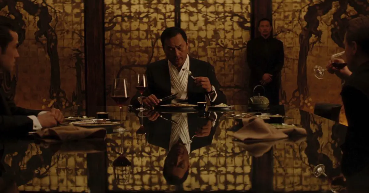
Is the reflection the image, or is the image a reflection, is what seems to be the implication in these establishing shots.
Recursion as a storytelling device
The repetition of certain patterns or events that can go on for infinity, otherwise known as recursion, is a crucial occurrence in Inception, both narratively and visually. We already know that the film is brought full circle by the sequence in the beginning, but repetition is layered in deeper than that. The idea of killing yourself in a dream to wake up in reality is at the heart of the conflict in the film. Cobb’s wife, Mal, is driven insane by it. By introducing repetition to the idea of reality versus dreams, Nolan effectively creates an endless search of reality within the operative discourses of the film. If one erases the boundary between the dream world and reality, it would result in an infinite cycle of waking up to different levels of the real world, over and over.
This is employed by Pfister while shooting prominent set-pieces. As Cobb teaches Ariadne (Elliot Page) about the dreamworld, she first causes a city block in Paris to fold in on top of itself, coming to rest upside down. Later, she drags two parallel mirrors to create infinite projections of Cobb and herself.
Similarly, another prominent set-piece in the film is in the form of the Penrose steps. As Arthur (Joseph Gordon-Levitt) informs Ariadne about different dream layers, these never-ending steps provide a surreal touch to the whole exchange. Again, surroundings over camerawork.
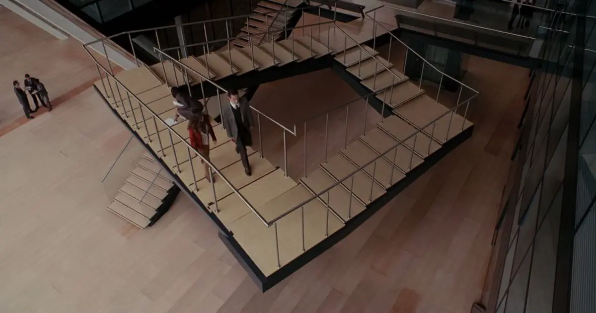
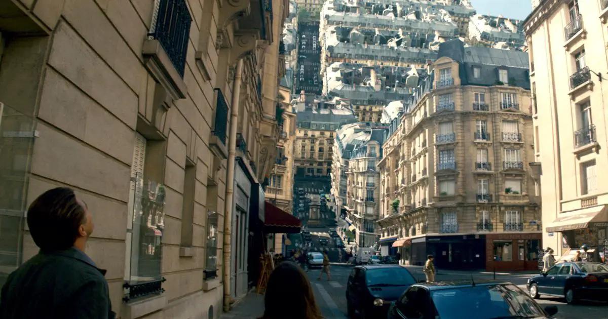
By building edifices that do not obey Euclidean geometry and could not possibly exist in reality, Pfister emphasizes the unreal-ism inherent to the characters’ surroundings. One of the most prominent usages of this is in the limbo world that Mal and Cobb inhabited for over half a decade. The buildings rise and crumble into the sea, while an immensurable landscape of identical looking structures that look like they rose organically from the earth stretch over the place as far as the eye can see.
Inception uses very few digitally enhanced or CGI shots and frames, and most of them were used for building limbo. Pfister used frames from principal photography in Morrocco, along with digital effects to create a world that looked like it was continuously in motion.
Color
Inception follows a fairly consistent color palette of earth tones, warm lighting and neutral colors in its frames. However, Pfister uses distinctive sets of color to separate the multiple levels of storytelling in the film. For this purpose, let us consider the three dream levels for the main inception event in the film.
First layer
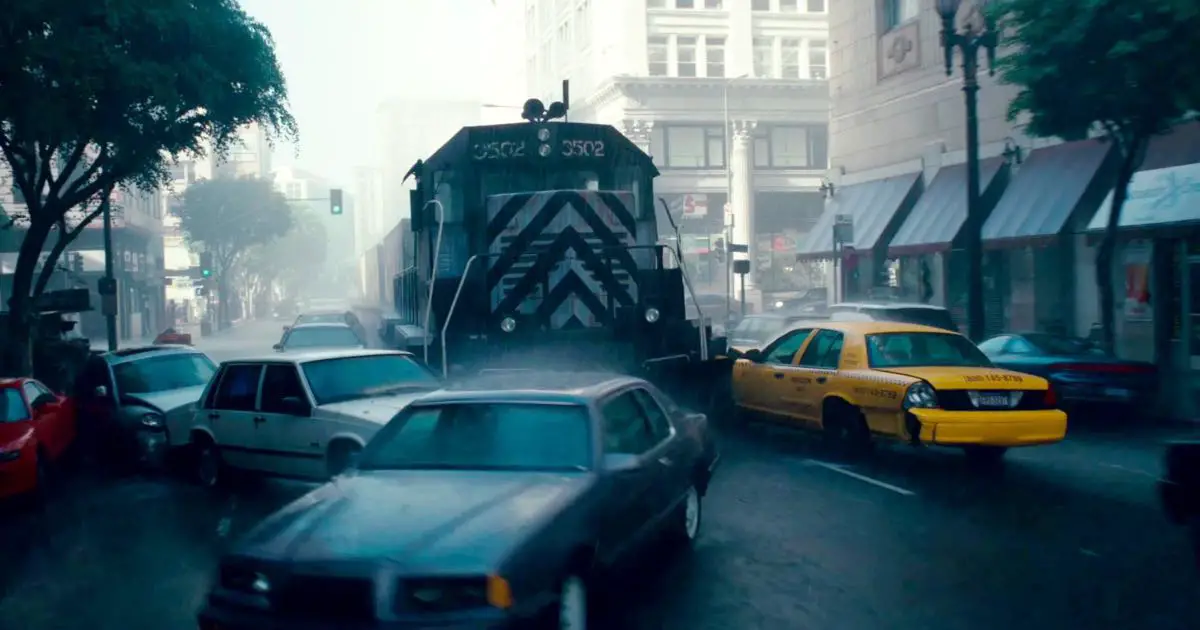
The setting for the first layer is Los Angeles drenched in rain. Blues and dim greys render the city virtually unknowable, as we follow a tight car chase on the streets. The color allows an incredible amount of control over what the audience sees and how it sees the action unfolding. The dull greys and metallic shades washed over with the rain provide the perfect backdrop to the subconscious of Robert Fischer, who thinks he’s being attacked. The obscurity of the architecture and the roads serve a narrative purpose as well – Cobb mentions earlier in the film to never build from memory and only use vague details.
Second layer
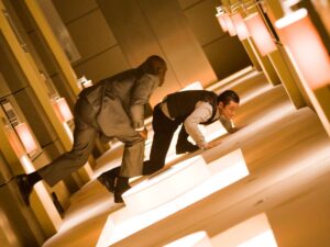
The hotel that serves as the second dream layer arises from the subconscious of Arthur. Hence, we see a return to warm lighting, brown and neutral tones along with clean, straight lines. These are all consistent from the first dream sequence with Saito at the beginning of the film, as Arthur had been the dreamer then as well. The straight, right-angled geometry of this layer is to draw out attention to even the most subtle tilt shifts, as evidenced by the iconic hallway fight sequence.
Third layer
For the final, heistlike climax, Pfister and Nolan utilize a setting that is a homage to Bond films of the past. With an icy mountain fortress that seems straight out of the sets of From Russia with Love, this layer is all white. The minimalism emphasizes the high stakes, as every non-essential element is removed from the composition to direct focus towards the emotional catharsis of the film.
Slowing Time
Slow motion effects are used to emphasize the revelation of the subjects’ dreaming. From the first sequence of the water crashing in at Saito’s party as the fall kicks in, to the cafes and buildings of Paris exploding to reveal Cobb and Ariadne’s presence in the dream, slow motion functions as a storytelling device. As the film emphasizes the slowing of time in each subsequent dream, slow motion captures of events become a crucial plot device, not just an aesthetic choice.
The fight in the hotel hallway is a great example of the same. The sequence, which was shot without any CGI is presented slowed down so as to compound the dreamlike nature of a fight sans gravity. It is also a testament to the commitment of both Nolan and Pfister to a naturalistic mode of cinema, that the scene was shot in a fully constructed rotating hallway, instead of using digital tools.
Conclusion
As a film that frequently shifts gears between the subconscious and the conscious, Inception is a demanding experience. Ive found it enriching with each subsequent watch. But a big part of that has to do with Pfister’s cinematography, his vision of bringing such an extraordinary story to life. Inception is lovingly crafted with all the perfection of a delicate puzzle box. As the pieces fall into piece, one cannot help but think that Pfister has indeed perfected a visual language to represent the dream-like experience of cinema itself.

