With The Tragedy of Macbeth Joel Coen reinvents Shakespeare’s masterpiece in a brilliant and innovative amalgamation between theater and cinema. The faithful adaptation makes this film one of modern cinema’s greatest adaptations of a Bard’s play. Steered by impeccable direction, compelling performances and breathtaking visuals, this is a remarkably detailed work of mise en scène. The greatest triumph of The Tragedy of Macbeth is the sublime conversation it creates between set design, lighting and cinematography. All these collaborations amount to an atmosphere and mood that stays with the viewer long after screening.
The plot of the film is familiar to the viewers. Witches (Kathryn Hunter) tell Macbeth (Denzel Washington), a Scottish warlord, that he will become king. Macbeth shares the prophecy with his wife (Frances McDormand), who persuades him to murder the benevolent King Duncan (Brendan Gleeson) and take possession of the crown. But committing the heinous crime, Macbeth does not find the road ahead to be smooth and even. While Lady Macbeth’s own guilt pushes her toward madness.
In his review for The New York Times, popular film critic A.O. Scott wrote: “The director Joel Coen’s crackling, dagger-sharp screen adaptation of the play — called by its full title The Tragedy of Macbeth — conjures a landscape of appropriate desolation, a world of deep shadows and stark negative space.”
Let’s delve into the various aspects on how the close collaboration between the director and cinematographer have permeated several layers of the film’s conception — from their minute care and concern for detail of prop and decor to creating a period locale which consolidates to enhance the film’s aesthetic value.
Black and White Imagery
The magical charm of monochrome has always attracted the attention of contemporary filmmakers even in an age of cinema where color has achieved new cinematic heights. Whether it is Steven Spielberg’s Schindler’s List (1993), Martin Scorsese’s Raging Bull (1980) Alexander Payne’s Nebraska (2013) or Alfonso Cuaron’s Roma (2018), black and white images have always enriched the narrative with tranquility and beauty.
The mutual creative decision of Joel Coen and cinematographer Bruno Delbonnel to shoot the film in black and white helps in capturing the meticulous detail within the minimalistic splendor of the milieu. The entire film was shot in color and converted to black-and-white in post production. Delbonnel did this in order to use the RGB curves as a form of filtration and be able to play with the blue layers. According to him, “If you do that on a color sensor and transform it into black-and-white, the blue behaves like a filter that changes the skin tones and everything else, so in the DI we were able to expand the gray scale using all three curves.”
“My Elizabethan English is not that good,” the French cinematographer said, “but in the play, the characters are always talking about night and day and not knowing which is which. So color would obviously be very obstructive. Following Shakespeare’s lines motivated the decisions we made and helped us to pick the best moments which would be just gray. Then the sudden move to more contrast would be more powerful.”
In the following shot the use of black and white helps the film achieve a high degree of accomplishment. It looks as if the film is painted with light. It imparts a sensuous quality to the texture and feel of the film and heightens the muted recreation of a period and its ambiance.
The aspect ratio of 1.37:1
In The Tragedy of Macbeth the aspect ratio of 1.37:1 plays a very crucial role in defining the visual grammar of the film. It creates a visual structure where the frame within a frame positions the actors in a powerful and imagined cinematic space.
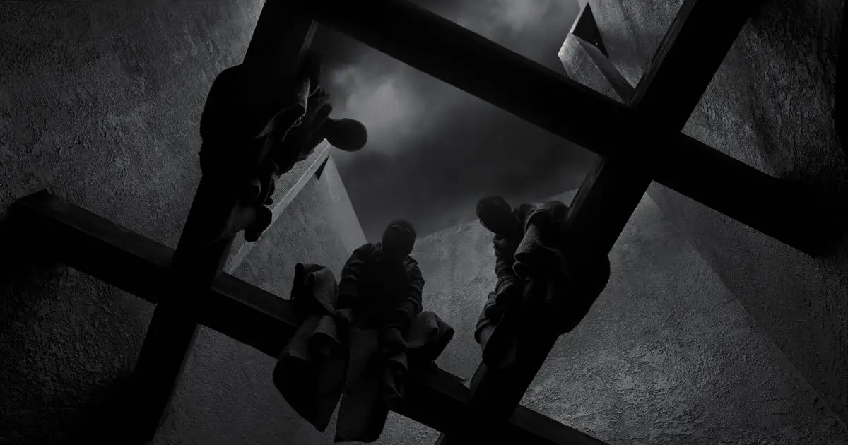
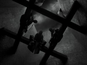
For instance, in the above shot, where the witches (Kathryn Hunter) are perched on the beams of an open calling in Macbeth’s castle, the framing makes the mood more dramatic. Here the field of view will invariably affect one of the first rules of composition, which is ‘The The Rule of Thirds’. It enables the shot to create a visually compelling image which draws our attention into the whole image, as opposed to just focusing on something in the center. The intersecting lines create reference points for where to position our gaze and thus creates a dynamic and interesting composition. Despite the tighter ratio, we never become overwhelmed by the wide-open space of the sky above. Such kind of framing creates an intricate composition, layers the characters with intricate characteristics and builds a sense of depth.
Enormity of Wide Shots
The Tragedy of Macbeth makes masterly use of wide shots to capture the feel of the background, setting, atmosphere of the subject and making use of striking visuals to communicate the theme. The minimalism employed opens up a rich tapestry of abstraction that allows the viewer to virtually inhabit these spaces.
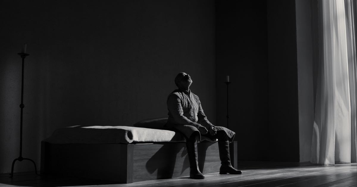
In the following shot, we observe Macbeth (Denzel Washington) sitting in complete isolation contemplating his future course of action. We observe that the room which is a part of the castle is sparsely decorated. It is devoid of any furniture except the bed. The strong diagonals within the frame and the open ceiling above metaphorically weigh down on the characters. It represents how the karma of our protagonist is generating a sense of oppression on him. Hence the wide shots used in the film complete such visual ideas and create deeper meanings.
It’s more like a drawing than a painting where the mind of the viewers fills in the blank part. By utilizing shadow, shape and depth cohesively with the image pattern of the film, the wide shots become distinctly unique. It also enhances in bringing out the delicate nuances of light and shade resulting in a strong visual presentation.
Complexity of close ups
On closely observing the theater-like dialogues of the film, we can listen to the rhythm of Shakespeare’s language and the power of the lines. To make this more impactful, the close-ups aid in establishing the presence of the actor on screen. When a close-up shot is composed in 1.37 it fills the screen and brings a vivacity. The set disappears and brings the face and the text of the film to the forefront. The characters composed in close-up smack in the middle of the frame, and deliver a euphoric feel. After all, close-ups exist only in cinema and not in theater, which makes the film so unique.
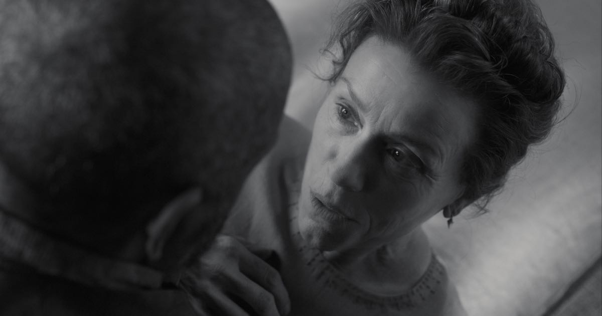
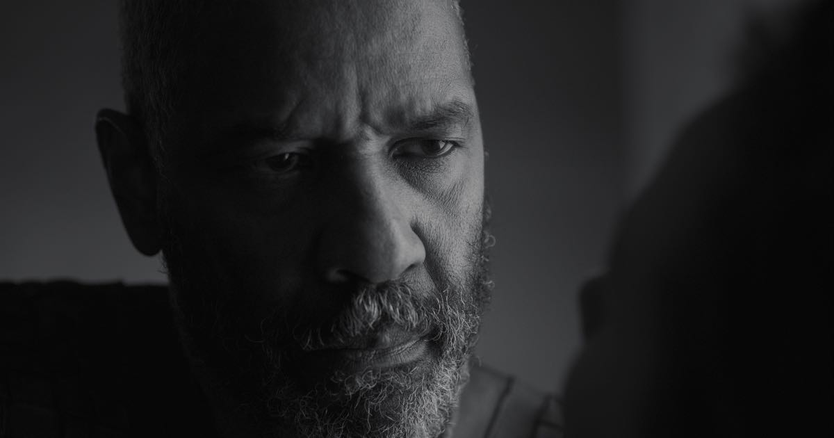
In the following two shots Lady Macbeth first speaks to her husband about murdering the King. The composition displays that she is more ambitious and ruthless than her husband. As soon as an opportunity to gain power presents itself, she has a plan in mind. She uses her influence to persuade Macbeth that they are taking the right course of action and even takes part in the crime herself.
In the reverse shot, which is the close up of Macbeth, we observe that when he hesitates to murder, she repeatedly questions his manhood until he feels that he must commit murder to prove himself. He has been manipulated by Lady Macbeth with remarkable effectiveness, overriding all his objections.
Use of contrast to enhance depth
Bruno Delbonnel achieves artistic and technical excellence in his department through superb reproduction of tonalities and stark compositions. This helps him maintain a constant texture that adds psychological depth to the scenes. Further the lighting aids to reveal the emotions of the characters and frame the power of Shakespeare’s verse.
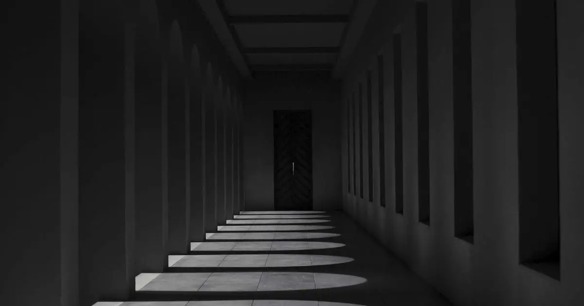
In this shot of the interior courtyard in Macbeth’s castle, Delbonnel displays how the shadows on the floor and walls lend depth to the shot.
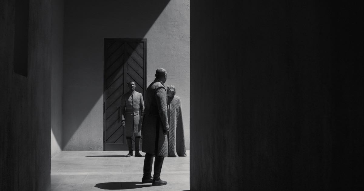
In most of the scenes the use of such contrast succeeds in visually capturing the dark spirit of the film. This scheme of contrast lighting enabled the filmmaker and cinematographer to create their own weather and put the sun where they wanted it. They weren’t concerned with motivating light from a direction, or in being consistent with it. At times it’s hard to tell whether it’s day or night. The light is never justified. It sometimes comes through windows, but often we don’t know where it’s coming from. Light in this film has been used as an artifice to evoke contrast. Thus the light becomes an integral part of the narrative element and acquires the shape of a graphic element that represents the Gothic noir of German expressionism.
Conclusion
The Tragedy of Macbeth is a brave and uncompromising endeavor. The staging, shooting and editing here show Joel Coen at his most inspired, creating an undercurrent of exhilarating viewing experience. His meticulous vision grants the film new levels of artistic excellence, for delicacy of treatment and subtle use of the film medium with a searing intellectual honesty, It is an extremely detailed and stylised piece of work that generates an eerie feel.
In an interview, Joel says, “I wanted to go as far as I could away from realism and more towards a theatrical presentation,” he said. “I was trying to strip things away and reduce things to a theatrical essence, but still have it be cinema.”

