There’s a reason Alfred Hitchock’s Vertigo is so mesmerizing. The scenes of Jimmy Stewart losing his mind convey a wealth of information. They’re nightmarish and surreal. The best films leverage the visual medium to tell their stories, making the narrative more engaging than simply reading it to an audience. Mastering it requires a lot of work. How much work? Well, let’s delve into the intricacies of visual storytelling and how it’s used in film.
Speaking Through Visuals
There’s a familiar saying in filmmaking; “Show, don’t tell.” It’s more effective to convey a setting or mood through what we see than what we hear. If everything needs to be explained, you might as well read a book or listen to a radio play.
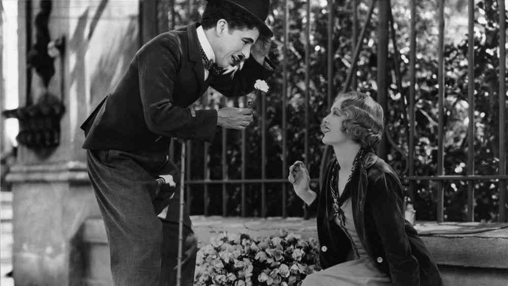
The most distilled version of visual storytelling is silent films. Charlie Chaplin’s City Lights from 1931 is a prime example. Even though there are title cards, you really don’t need them to understand the film. Chaplin tells us everything we need to know about his tramp character. From his earliest scene, the suit-wearing underdog observes a statue in a window. The shot tells us he is an outsider. It also tells us that he’s oblivious as he narrowly avoids falling down an elevator shaft on the street.
WATCH: 11 Stunning Examples of Visual Storytelling
The physical performances make the characters known. On his adventure, the tramp falls in love with a beautiful woman. He also befriends an alcoholic. But the hallmark of Chaplin’s movies is how he interacts with his environment. He challenges the viewer to be more in on the joke than the tramp. We get to see the pitfalls the tramp doesn’t see. We get to see the dangers and accidents waiting to happen. The reactions of Chaplin to these events is what makes City Lights so great.
There are many more marvels from the silent era. We could go more into the exploits of Harold Lloyd, for example. But there’s so much more to visual storytelling than silent slapstick. So let’s turn the camera around and focus on, well, the camera!
RELATED READ: The Language Cinema Stole: How Film Learned to Tell Stories Before It Knew What It Was Doing
The Camera Tells The Story
The camera is to a filmmaker what a pen is to an author. It’s through the camera that a director can communicate without words. Its placement reveals what the director wants us to see and, more importantly, what is significant.
The best showcase of camera-oriented storytelling can be seen in silent films. Without the aid of recorded dialogue, filmmakers had to speak more through action than words. True, they could have used many title cards for a dialogue-heavy film. At that point, however, you’re pretty much reading a book.
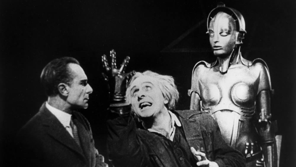
A fine example of strong silent visual storytelling can be seen in 1927’s Metropolis. The Fritz Lang directed film has a lot going on visually. With its towering futuristic cities, it can be easy to get lost in the visual splendor. Lang’s camerawork, however, tells us everything. He centers the frame on what’s important. In one scene, the camera takes on the POV of Freder reaching for something. We see what he sees. The camera and the audience become Freder.
This great shot has been replicated many times, even in modern movies. Just look at Enter The Void.
Although this film is about drug trips more than the future, it shares the POV shots. In fact, Enter The Void is entirely shot in the first person. We see everything that the character witnesses throughout the entire film, from personal conversations to drug trips. By doing this, director Gaspar Noé can make the themes of emptiness more personal. We’re not just watching somebody go on a wild out-of-body experience. We get to go on that trip ourselves. There’s an evolution between Metropolis and Enter The Void. Sure, the computer graphics are more intricate in Enter The Void. But there’s also the faith to hold on POV shots. Metropolis dabbled in a lot of filmmaking techniques.
Enter The Void expanded on them while still adhering to the same shot principle. Both films feature hands reaching out from the screen in those POV shots. Those are our hands. The director wants us to feel that same urge to reach out. The camera gives them the ability to do just that. Computer graphics may replace the traditional camera tricks, but nothing replaces the splendor of visual storytelling.
If you’re looking to dive deeper into visual storytelling, Canon EOS M50 Mark II captures stunning visuals with ease. It’s great for both beginners and pros looking to tell compelling stories through their lens.
Buy Canon EOS M50 Mark II (Amazon)
The Long Take
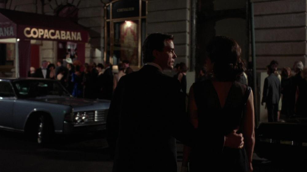
If there’s a shot that always gets a lot of attention, it’s the long, unbroken, continuous shot. And one of the most iconic examples of this shot is Scorsese’s Goodfellas, where Henry enters the Copacabana nightclub. The camera follows as Henry progresses further into the club. We get to see the back entrance, the kitchen, and the club floor.
Technically, the shot is impressive. More importantly, however, it reveals a lot about Henry. In the documentary Getting Made: The Making of Goodfellas, Scorsese spoke about how the shot frames Henry’s life. It highlights the seduction of his lavish lifestyle and the temptations before him. It’s a shot as narratively important as it is visually stimulating.
The shot was so remarkable that even film critic Gene Siskel attempted to try it.
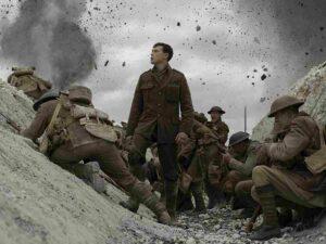
While the continuous shot feels like a challenge, it still needs a purpose. Something important needs to be conveyed through the constantly moving and recording camera. This is especially true if your whole film is going to be one continuous shot. This was very much the case with the war film, 1917. Directed by Sam Mendes, this World War 1 epic follows the journey of one soldier. In a long, continuous shot, we watch as he ventures through enemy territory.
Mendes’s film is impressive for the ambition alone. But what makes it more compelling is its personal appeal. The audience gets to feel the chill of being a soldier on the ground. There’s chaos and concern around every corner. It feels like Mendes trying to get us as close to the experience as possible. It’s easier to care for the soldier’s fight for survival. We share the experiences with him in real time. By the final shot of him taking a rest, it feels deserved and important. His mission mattered. More importantly, that whole continuous shot mattered.
The Power of Color
Color in filmmaking can do more than make a scene look pretty; it can convey a sense of time and place. Greta Gerwig is a master at utilizing color in her movies. Her most lavish film, Barbie, is bursting with hues. Barbie Land is depicted as a vibrant pink paradise, staying true to the toys’ palette while showcasing the whimsical nature of this land. Compare that to when Barbie ventures into reality, where the colors of the Mattel office are dimly lit and dull. The message is clear: Barbieland is a place of wonder and imagination, while reality is much harsher.
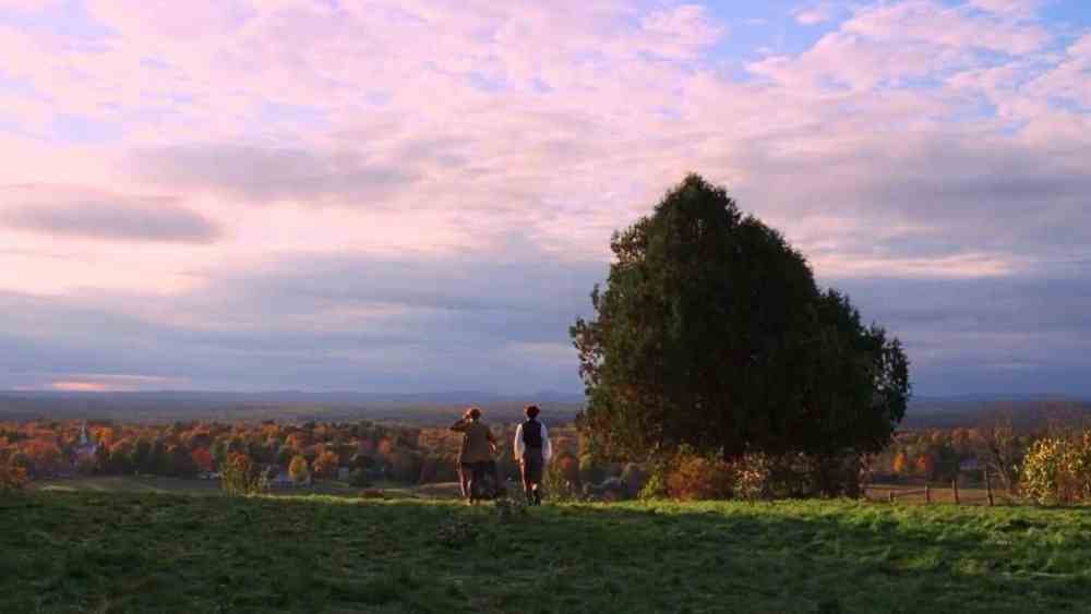
Another fascinating use of color by Gerwig is in her 2019 adaptation of Little Women. Here, Gerwig uses color to convey points in time. The nonlinear narrative jumps between the rosy past and the bitter future. There is no title card to establish the switch between periods.
Instead, the colors act as the calendar. Scenes of the four women as younger and more carefree feature warm colors. Scenes of the sad future come with cooler, more muted colors. Gerwig even frames the same scenes with similar shots but different colors to compare. By doing this, she makes it visually clear where we are in the timeline. No subtitles or map is required.
Delve deeper into how films use color to tell a story.
More To See
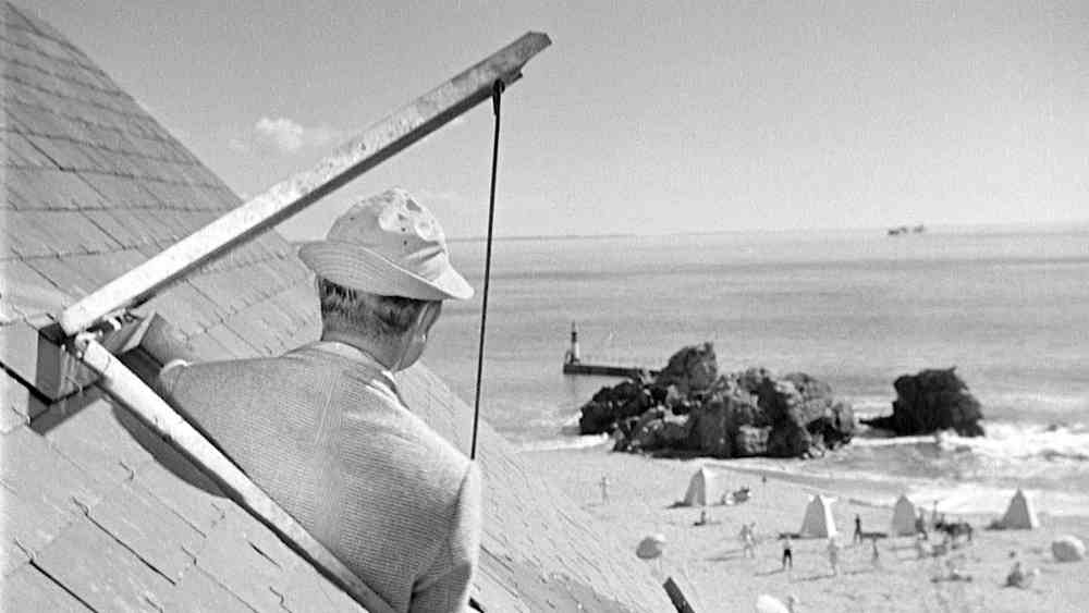
Visual storytelling doesn’t have to focus on one thing. The camera can absorb so much and challenge the viewer. One of the best directors for juggling our eyes is Jacques Tati. His films are purely visual. Mr. Hulot’s Holiday is a great example of scenes with so much going on. What’s clever about Tati’s staging is that the viewer experiences more than Hulot. While Hulot is on the beach, he paints as the tide rolls in. The waters seem to wash away his paints, but return them at just the right moment. Hulot’s obliviousness is amusing, but so is the wonder of the world around him.
Tati expands the frame more in Playtime. This film features Hulot wandering around Paris. It’s even more chaotic than his previous holiday. There’s traffic in the streets and busy people going about their jobs. Around every corner is some wild device or invention. Tati pulls the camera back far enough to let us take it all in.
One of the most memorable shots is when Hulot finds himself dashing around a cubicle farm. There’s more going on than Hulot’s scurrying. We see employees having conversations over the phone, despite being next to each other. There’s even more going on when Hulot stumbles into a convention of new products.
Tati is able to say so much in his many scenes. And he does so with minimal dialogue. You don’t need to know French to appreciate the storytelling. Tati’s direction is more or less that of a silent film for the age of sound.
Part of how Tati makes this work is by mastering his environment. The director turns his surroundings into characters all their own. This is especially true in Playtime’s restaurant climax. The restaurant is a mess of the structure falling apart. It affects the food service, the entering customers, and the dance floor. To make all this work, Tati basically built this version of Paris. It was a project that almost bankrupted his production. But the results speak for themselves, without dialogue.
The Simple Methods
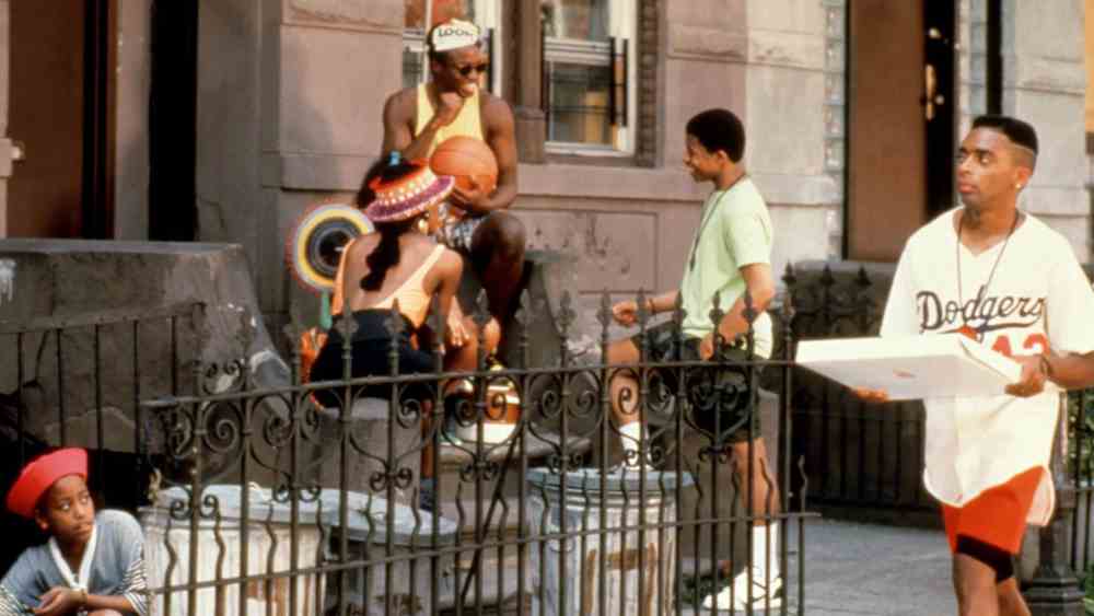
You don’t have to go bankrupt building a set though. Strong visual storytelling can be used to convey mood as well. Spike Lee’s Do The Right Thing is a film that could best be described as heated. The setting is hot summer in Brooklyn. Racial tensions in the neighborhood are as high as the temperature. Lee communicates this well by featuring plenty of close-ups of the character. We get to see the sweat on their faces. We can feel the exhaustion in their expressions. There’s rage boiling in everybody.
Spike Lee takes the direct route in framing this film. Oftentimes, characters will speak directly to the camera. One of the most memorable shots is the medium close-up of Radio Raheem. He speaks bluntly about his brass knuckles. One is labeled Hate, the other labeled Love.
Cinephiles will recognise the reference from Night of the Hunter. Preacher Harry Powell is seen in the film brandishing these tattoos on his knuckles. He uses them to preach about his spiritual philosophy.
Lee’s framing of the Love/Hate monologue is a nice tribute, but also a compelling modernization. Both films frame an intimidating character. The key difference is that Powell is preaching more towards the other characters just off screen. He keeps looking that way to ensure he’s manipulating the right people with his words. With Radio Raheem, he’s not just speaking to Mookie. He’s looking directly into the camera. He holds up his knuckles for all to see. Radio Raheem is speaking to us.
Wrapping Up
That’s the best way to convey visual storytelling. Take note of what makes these many films visually unique. Whether it’s a long shot following a character or a close-up of rage, it all works for telling a story. But don’t get lost in the visuals. Make sure there’s a story being told. Anybody can speak directly into a camera or push one through a restaurant. But only a skilled filmmaker can make these moments interesting and purposeful.
What are some of your favorite scenes where visuals alone tell a story? Let’s talk in the comments below. And if you enjoyed this video, be sure to like and subscribe to Flickside. Until next time, keep honing your skills and let your visuals speak louder than words.
Disclaimer: Some of the above are affiliate links. We may earn a commission if you make a purchase.

